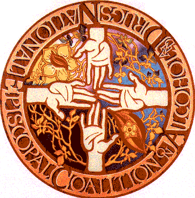
The logo of Recovery Ministries was originally designed when the organization was called the National Episcopal Coalition on Alcohol & Drugs. It was first designed as a shield-shape banner by Carolyn Lesser of the Diocese of Missouri, and was a gift of that Diocese. More recently it was done in a circle-shape logo in both black & white and in full color. Following is the artist's explanation of the symbolism of the logo.
In the lower left quadrant the colors are dark and heavy, and the vines nearly bare-- the despair of addiction. The addicted one's hand reaches up for help. The colors of the lower right quadrant are lighter, and surround the red-orange flame of the Holy Spirit with the gold flower of hope inside. Represented here are the addicted one's awareness of the need for help-the hope for health. The hand of the support group reaches out from the right to offer that help.
The colors of the upper right quadrant are light and joyous, and the vines covered with the green leaves of life show the growth of health and help between the support group and the addicted one. The hand of God reaches down from above with everlasting love and acceptance. In the upper left quadrant a golden flower with the red-orange flame of the Holy Spirit inside is surrounded by vines of life and health--the flowering of the addicted one into health. He now has the seed of hope to give help to others, and the hand of family and parish support reaches out to sustain him. The golden circle of vinewith golden leaves running through every quadrant signifies God's presence with us at all times.


